Sunday, January 20, 2013

Andreas Franke

Deep in the waters off the coast of Barbados there lies a merchant vessel lost to fire long ago, the SS Stavronikita. Permanently enshrined as a scaffold for a coral reef, the ship has become a haven for all matter of undersea life since its demise. The result is an intricate web of lifeforms clinging to and moving about the silent ship, muting the hard man-made edges of the structure while adorning it with the most interesting of shapes and textures. It is some of these values (as well as some existential bullshit about the obvious "life finds a way" metaphor that permeates these kinds of landscapes) that initially drew the attention of photographer (and photo manipulator) Andreas Franke, in his "The Sinking World" series. Juxtapositions of the sunken ship with period costumes may seem like something out of a Celine Dion music video circa 1997, but the images are fresh, and the subject matter flippant. Rococo (the style of his costumed models) glorified an aesthetic of excess--Can you put any more gold leaf on that? Then do it. Cover everything else in and mink and lace? Done. The result is a ballooning of textures and decadence that works as a nice focal point for the silent, grave-like silhouettes of the dead ship, also decadently adorned by festive corals. While too much of this kind of kind of art can descend into pure kitsch, these, and the rest Franke's work are definitely worth the browse.


Check these and more out at Franke's website: The Sinking World

Friday, December 21, 2012

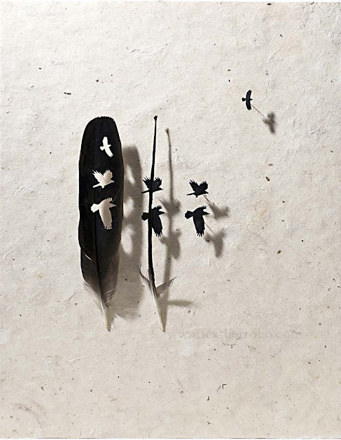
Chris Maynard

So some people love cars. Some people are into feet, whatever. That's cool. Then there's Chris Maynard, who is, quote: "Obsessed with feathers". His obsession, however niche, has translated beautifully into a body of art work that is both aesthetically pleasing and nuanced. While normally I tend to cast stink eyes on any artist that produces only one specific subject matter: your blue dogs, warpy buildings, your silhouetted jazz musicians, Maynard happens to bring something new to the table each time while maintaining his feather-cutting media. The result is not kitsch, but an exploration of color and texture. I've selected a few of my favorites of Maynard's work, but please check out his site for more examples of his original technique.


Check out more of Chris Maynard's work at the aptly named:

Wednesday, March 7, 2012

Ralph McQuarrie

     Having been founded only within the last 300 years, America is, in the large scope of things, a relatively young country. While this may make us the plucky, optimisitic youngster on the global scene, it also means we have no where near the bredth and depth of national identity that has been crafted in ancient societies like China, Japan, or the old world nations of Europe. In the past, attempts have been made (by individuals as well as the national subconscious) to fill this cultural gap--folk stories like Paul Bunyun or John  Henry fantacized the pioneer spirit of the West ( as well as the logging and railroad industries). The space race ignited flagging national pride in the 60's. 
     Today, however, as the world becomes more global, and the strengths and weaknesses of American culture are under constant debate, many Americans have turned to a different source of personal inspiration, an ancient, epic tale filled with American values like loyalty, honesty, pride, redemption, the triumph of good over evil, democracy over imperialism--yes, I'm talking about Star Wars.
     For a set of hoaky (but well-written) science fiction films from the late 70's, these films have captivated the American mindset in ways no other fictional stories have been able to acheive, except maybe the Bible, but I won't go there. Browse the internet for any amount of time, and you're bound to find how deep Star Wars has pervaded our cultural consciousness--the sheer number of fan-made art, costumes,  films, cartoons, toys, clothing, and fiction is incredible, and people only want more. Even the failed attempts at re-establishing the franchise in the early 2000s was met with an explosion of support and enthusiasm, despite the lack of direction/acting/storytelling/artistic merit that defined the later three movies.
     With the religious-like furvor that people have for this series, it's often hard to remember that each moment in these films was crafted by an individual: imagined, designed, and executed by an artist. One of these such artists, or should I say, THE artist, behind Star Wars, is the amazing illustrator and aeronautics expert, Ralph McQuarrie, who died this week. Responsible for creating the iconic looks for all of the original Star Wars space crafts, as well as C3PO and Darth Vader, his personal touch created much of the palpable textures and atmospheres that make the pre-CGI sets of the original films so amazing from an artistic standpoint. His huge body of work (mostly done in oils) give amazing depth and feeling to stories we've all probably watched dozens and dozens of times. Beside his design skills, McQuarrie's sense of space and color are inspiring in themselves, and any aspiring illustrator should take serious note.
    As an aside, I also appreciate McQuarrie's design panels that didn't make it into the movies--images like the entrenched rebels in the snow, that add more texture and increase the scope of an already epic story. Below, i've included a rather extensive body of McQuarrie's Star Wars work, however, it should be noted that he did design work of many notable films, like E.T., Cherry 3000 (check it out on Netflix...it's awesome), Close Encounters of the 3rd Kind, among others. Enjoy.




Tuesday, February 28, 2012

Phillip Low

     So it's been a while. I realize that. But what better way to get back into the swing of things than in a discussion of something at the core of every piece of art, architecture, clothing, and object that we encounter--the mindset of the constant consumer. Now I'm not talking about the money-spending type of consumption. I'm referring to the great extent of our unsung consumption of media.  With the advent of iphones, Pinterest, and the rabbit hole that is Reddit, we live in an time and space where we are constantly immersed in media-photos, art, video, books. In years past, the power of an artist's work has been defined by the caliber of gallery it resides in, where today, anyone who's made anything (and I mean anything) can find a venue and an audience on the web. Where I am I going with this, you may ask. Here's where--as people begin to constantly consume media of all sorts, subtle motifs that may have been novel in the past quickly become trite and over-worked. Watch a thousand hours of television on netflix and patterns in the chaos begin to emerge, diluting the gravitas of many films to that of a good kitten video on Youtube. While this evens the playing field for some (kitten videographers, for instance), it also forces artists of all genres to step up their game. When an audience has seen almost everything, and has the rest of it at their fingertips, an artist today must completely outshine the enormity of the human consciousness in order to maintain relevancy--not an easy feat, but it gets done often enough. What's even more amazing is when it is done with a subtle delicacy--when a simple idea can capture the short attention span of the digital world and cause a pause, a comma, a breath in the race across the Internet. Today, this artist is Phillip Low.
     Originally an sculptor that worked in acrylics, I stumbled onto his work through a design blog who suggested buying his prints to make some kind of decor statement (gross). But, after staring at the facets of his disembodied gems floating in some unseen purgatory, I couldn't help but enjoy them. The colors are soft and subtle, the lighting is impeccable, and I am not pushed to remember something that had come before them. They are lovely in their simplicity, and should be enjoyed for it, even if for only a digital moment.


To purchase a limited edition print of these gems ($45-$65), check them out here:

Tuesday, November 22, 2011

Fumi Mini Nakamura

It's hard to make art that describes the intricate connection the human soul has to the natural. Sure, you can say you relate to the power and majesty of the gray wolf, but try to depict that, most of the time, you're going to end up with some horrible piece of detritus like the three wolf moon shirt, of meme fame. Though, in tri-wolf's defense, the rules for wolf art have been clear cut since at least the early 70's: While one wolf is good, more wolves are better, and none should be depicted without accompanying tye dye, moon, monster truck, or dream catcher. The work of Mini Miku Nakamura, however, decides to break most of these rules in favor of a softness that captures the drama of this subject without the quaint crap. Each of her pieces, cleverly arranged in a whirlwind of color and line, contains a quiet contradiction in human life-- whether it is acceptance of death, the frustration of sex, the  realization of our role as a species among species, or the madness that emotions like love create in our classicly animalistic nature. The fact that these are all done in colored pencil only makes these more amazing. Enjoy.


These and more works by Fumi Mini Nakamura can be found at her site: