Showing posts with label paintings. Show all posts

Tuesday, September 20, 2011

Willem de Kooning

So artists and art critics have been drooling over abstract expressionist Willem deKooning's work for the better half of the last century, and for good reason. The guy painted for over 70 years, and produced a huge body of diverse work, including paintings, drawings, and some particularly lumpy sculptures. But, most of what can be said about his work has already been addressed, either in hours of boring modern art lectures, or in the pompous overwrought musings of internet art nerds (myself not included...ha..ha..) Today, however, I'm not going to talk about his now oh-so-overdone style of action painting, or what his nudes have to say about the condition of women, or how he redefined art through a child-like perspective. What I find interesting about de Kooning's work is much more basic, and to all you aspiring artists out there, much more utilitarian--Color. As many comic book colorists, painters, and graphic designers will attest, figuring out which colors work well together to create a unified image that is pleasing to the eye is no easy task. There have been entire classes and textbooks written on the topic of color theory, and even then, knowing what color to paint a black cat is in the dark, or what the reflection of television light does to the color of fabric can seem almost impossible. De Kooning's work, however, shows a beautiful innate understanding of light and color, to the point where the nature and subjects of his abstractions are rendered inconsequential. Few artists can use color alone to impress mood or atmosphere upon a piece, but de Kooning delivers every time-- invoking feelings of claustrophobia, leisurely ease, or untold femininity without having to beat you over the head with a graphical representation. This alone makes de Kooning's works stand out in the world of abstract art, and makes each of his pieces an interesting study for those that wish to follow in his colorist wake.


All of these images are property of the Willem deKooning estate.
Currently, de Kooning's work is on display at the Museum of Modern Art (MOMA)
in New York. For more images, and how to go see them, check out their website:
http://www.moma.org

Thursday, June 30, 2011

John Martin

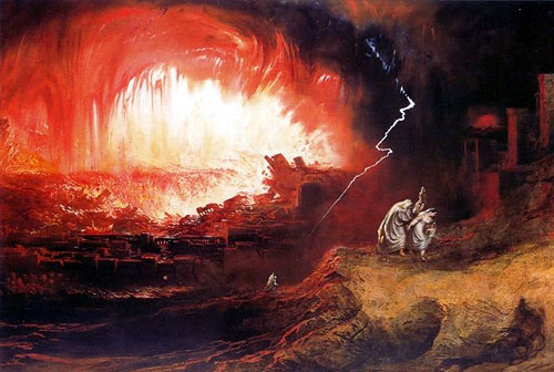
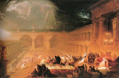
So, let's face it, the bible can be boring. For every action-packed  pillar of fire and brimstone episode, there's a couple hundred pages of what fabrics not to wear and whose dad was whose. Luckily for us, most of the cool stuff in the bible can be summed up in the works of Christian painter, John Martin. Martin lived during early 1800s, and was actively involved in the romanticism art movement, for all you Art 101 kids searching google images the night before your paper is due. It's okay, I won't tell anyone. Anyway, Martin's work is amazing in the depth and breadth of his landscapes, which are all pretty much apocalyptic. There are no sugary sweet fat Jesus babies being cradled by doe-eyed virgins in these works. Each piece shows the fiery wrath of God in full color, from mountains crashing down, exploding volcanoes, storms, floods, falling angels, you name it. And they are breath-taking. The thunderous crag-like clouds are ominous and foreboding, and you can really get the atmosphere he was going for. When they were made, the paintings were immensely popular, however, at the peak of his popularity, Martin gave up painting to pursue some other wacky enlightened endeavors, like redesigning the London sewage and water systems, railroads, and light houses. He was also considered sort of an odd-ball-- preferring to hiss during the national anthem, for instance. Though his paintings themselves are amazing, his body of work has continued as a major influence to numerous artists today, notably George Lucas, H.P. Lovecraft, and Derek Riggs, that guy that paints the covers for Iron Maiden.


Wednesday, May 25, 2011

Alex Pardee

To be honest, I'm not a big fan of cutesy art, especially paintings. I feel like the art medium of splashy watercolor backdrops behind over-rendered, graffiti knock-off line art is over and done, and any issue of High Fructose can attest to that. But, I happened to break this trend in my oh so refined tastes with the art of Alex Pardee. While he subscribes to the aforementioned painting trend, his subject matter is gruesome and creepy enough to keep the eye interested. Some of his pieces, especially the ones with creepy critters riding each other, keep the viewer pleasantly uncomfortable about each seemingly innocuous image, which is more than I can say for most modern painting. That being said, while I was impressed with the scope of Pardee's monster factory, he seems to lean on making art as marketing rather than craft, but then again, even artists have to eat.


All of these works belong to Alex Pardee, and can be found with much of his other work at